 |
| From WW452 |
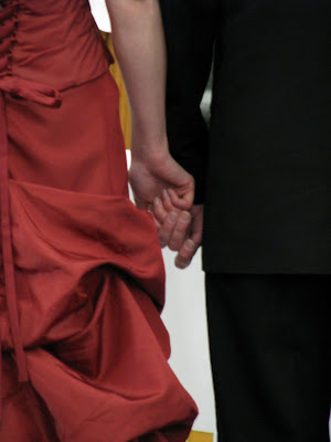
how Fred of Dee worked:
Now I wonder if I can remember how I made this; it did take a lot of blending. Used some of the ideas that Nordlark, Ariane and Draconis (and others over the years, e.g. the Shadow work in the lower-right) taught me of late...plus some practice with it.
First, it was easy to decide on a crimson gradient canvas, considering the Yin-Yang I'd Googled up to go with the red dress and black suit.
Three Osca Textures overlay that -- I'd been looking for a chance to use that Floral Wallpaper texture for several weeks, and this week looked like the time to try it. The Concrete and Lakewater textures are both Overlay-blended, whilst the Floral Wallpaper is Hard Light blended over the canvas.
When all was done, almost ready to post, I tried Mirroring and Flipping the Concrete layer around, really liked how it lit things up a bit more toward the lower-right while darkening things toward the upper-right and toward the left. and settled on the Mirror (horizontal flip) manipulation.
The Cineraria Flowerbed on the left is 100-pixel feather-edged on the right and then Hard Light blended against the layers below it. I tried another image or two over top of that, but couldn't bear to hide the honeybee; so I left it wide open -- it's purdy enough, and leaves tons of room for Desktop Icons...which Kelly and Hopfnkopf have been kinda pointing out lately, so I thought I'd take their pointers to heart this time.
After the cutout, I cleaned up the Source with Noise Removal tools and blackened it more with High/Mid/Shadow and Bright/Contrast tools, so that the black suit fully disappears into the black arm of the Yin-Yang with a Screen layer-blend.
The Yin-Yang took plenty of blending work, as it's left set at Normal -- no layer blending. I first cut all around the upper section with a 100-pixel featheredge, then switched to a 2-pixel Anti-Alias featheredge to cut out the bottom and erase most of the holes in the lattice work, along with frequent Selection/Modify/Contract=1 pixel to keep the selection from eating into the edges of the holes before I deleted them. (I left some holes filled in to make it look like the red fog surrounding the spherical section flowed a little way down, around and under those holes.) After that, I used Draconis' large super-soft Eraser tool to pat away some of the aura around the spherical part of the Yin-Yang to taper it down to the left and right tips of the lattice work below it.
The faint shadow under the latticework couldn't be Drop-Shadowed. So I recalled how someone here showed someone else here how to make a shadow, way back in WW30-something or so:
I clipped all around outside the latticework, then across the middle of its upper ribs, tracing along those ribs that lie BeLow the red part of the Yin-Yang. Then I copied it, killed the selection, and pasted it right back in as a new layer. Then I gave it a few stiff shots of maxed-out negative High/Mid/Shadow to blacken it, followed by a few shots of Blur.
Next I tinkered around with where to place it, decided on a shift down and to the right as you see it, and used the Opacity adjustment in the Layer Palette (where layer blending is also done in PSP) to fade the black shadow to a pale, translucent one. Done -- since there was no need to deform it to make an along-the-ground" shadow for a tall object.
It took some fair Googling around the next day (today) to maybe, Maybe find something appropriate to add to the entry...and then again, maybe not. When I ran across the Chinese Calligraphy -- with "'Chinese Temples" I think was my search term -- and took one look at its golden color, I decided that's what I'd been looking for.
So the calligraphy got lifted out, straightened up perspective-wise, darkened as described above to make the black fully black.
I found I had to select the leftmost symbol and the calligraphy to the left of it, yellow its too-red hue a touch, crank up its saturation, then give it a few stiff shots of High/Mid/Shadow to brighten it up more...because when I Screen layer-blended the calligraphy, the leftmost characters faded right out of view. So that was the fix.
(As you may know, Lighten or Screen banishes a black background and tends to fade shadier areas, whilst Darken, Multiply or Burn banishes white backgrounds and tends to fade brighter areas -- IOW, one does the reverse of the other. I use that little trick a LOT -- it saves me quite a bit of needless cutout work, lazy-lazy, especially where there's a lot of fine detail that cutting out cannot preserve.)
Let's see now, is that everything?
Oh yes, one more detail that I can recall:
There's a very faint 1,000-pixel long [Eye Candy4000:] Motion Trail plug-in effect on the red aura surrounding the left side of the Yin-Yang. It's about 85% faded to nothing and angled up toward the upper-left. I found that doing so took a drab area of the background textures and lit them up a little better, so that the whole area surrounding the Yin-Yang is awash in soft red light and then fades into the shadows.
There, I think that's everything. Guess I definitely followed the FAQ.
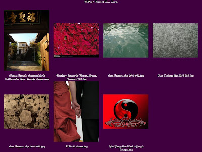
the parts used:
 |
| From !!!year09 |
the layers:
 |
| From !!!year09 |
the result:
 |
| From WW452 |
No comments:
Post a Comment